A Brand is Born
By early 2018, we had a strong product concept in our head, started to create our first basic prototype and we knew we would have to present ourselves to partners and potential clients soon. We were to start communicating with the world, so it was time to create our brand identity.
Quite a few of us have a background in marketing communication, had spent years at agencies, and therefore, the complex task to build a brand identity was not new to us — but this time it was our own baby so we were super excited.
1. The Brand Strategy
A brand identity (logo, name, typeface, slogan, communications etc.) is the sum of how a brand looks, speaks, and feels to people.
‘People’ includes our employees, business partners, clients, potential clients — therefore it is really worth putting some thinking into the basics: core values, positioning, value proposition and brand tonality.
These were the key points of our brand identity creative brief:
We (the company) are a Budapest based start-up. A team of experienced marketing professionals, technology experts and hotel executives set to revolutionize the guest-hotel relationship.
The Assistant (the product) is a friendly AI messaging assistant tailored to the hotel industry.
The Assistant is your new team member: Available 24/7 to optimize marketing efficiency, elevate your guests’ experience and increase revenues.
Always available — Knowledgeable — Friendly — Intelligent
2. The Name
First things first: let’s name the newborn.
We started by collecting English phrases that have some connection to hospitality. Weeks passed and we were getting nowhere. Not that we didn’t find anything, but we had too many options and none of them felt right. The solution now seems obvious: take a look at other languages. After we picked up Italian, German and French dictionaries, it didn’t took long for Gábor to come up with Bonhommie from the French word “bon hommie”. Later in the process, we decided to phonetically simplify it to have a nicer writing style and an easy reading in almost every language — which is crucial in the hospitality industry — : Bonomi.
The original French “bon hommie” literally means well-intentioned man, which just nicely describes how we think of our assistant who is always available and ready to answer guest queries. Plus it sounds good 🙂
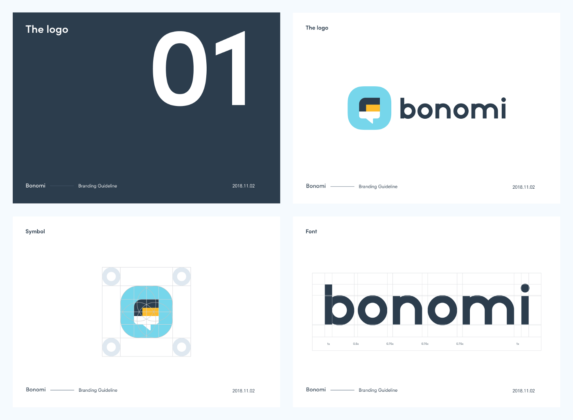
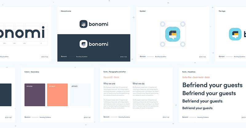
3. The Logotype
In the logo, we wanted to incorporate two key elements: the assistant as a person and the chatbot interface, which is an essential (guest facing) part of our product.
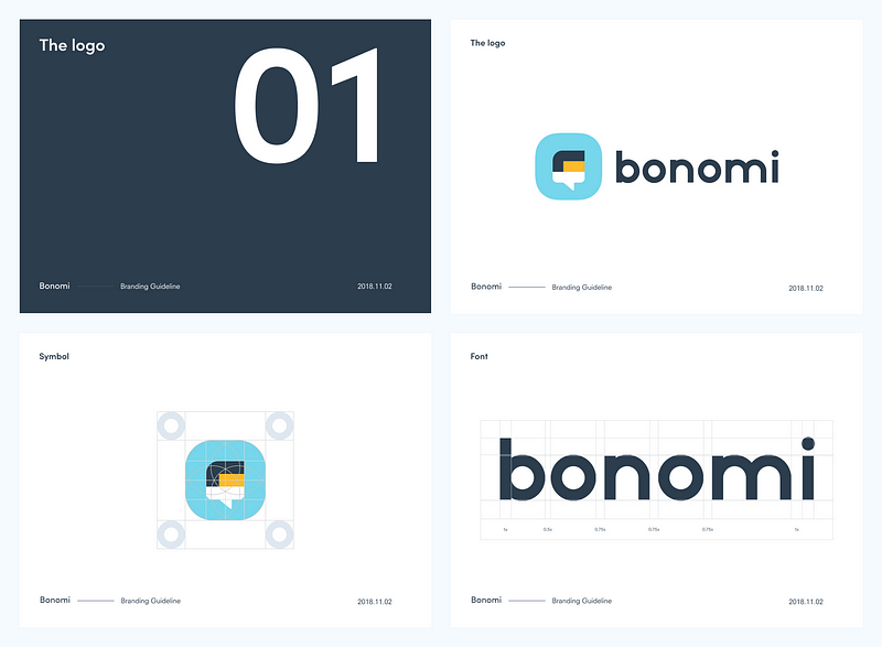
We came up with a form that combines a head and a chat bubble, surrounded by a background frame that invokes that icons of smartphone applications.
The logo also reflects that even though our product is technology based, we strive to make the guests’ interaction with the assistant a very human experience.
4. Colors, typography
As for colors, in the logo we mixed the classic, elegant combination of black and white with light blue and yellow colors that have a fresh contrast. The secondary colors are a friendly twist of warmer, earthy shades to provide balance on prints and screens.
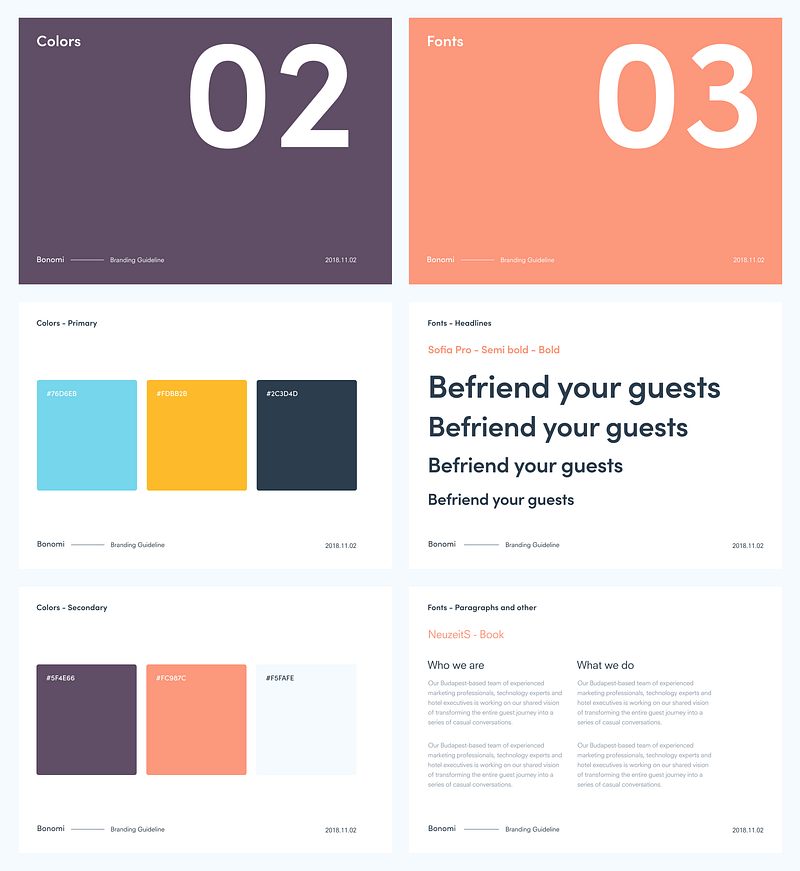
When we started searching for a font, we had a few criteria in mind. We needed something geometric and round to feel friendly and calm, and we wanted to avoid serious-looking fonts, so we went for sans-serif designs. In the end, our art director Levente created unique letters for our logo. For texts, we collectively decided on the Sofia Pro typeface.
The first public appearance of Bonomi as a brand was at BookDirect meetup in Hungary, and the interest of hospitality professionals is a proof that what we created is on brief and working. To see for yourself, head over to our website at bonomi.io!